KNUCKLEHEAD
How can you be countercultural and online? The concept behind this website’s visual direction.
CHALLENGE
Revamp my portfolio with a conceptual design language that explores the spirit of teen rebellion in the age of the internet.
SKILLS UTILIZED
Concept & Direction
Moodboarding & Style Tile Creation
Front-End Development
Visual & Interaction Design
BACKGROUND
This project started on a whim - no substance, just vibes. Spurred by a work activity I’d recently done to “make a moodboard of yourself,” I was dissatisfied with what I came up with during the limited amount of time I had and wanted to make something more creatively fulfilling.
I came up with the following directions:
“Kiki’s Living Room”
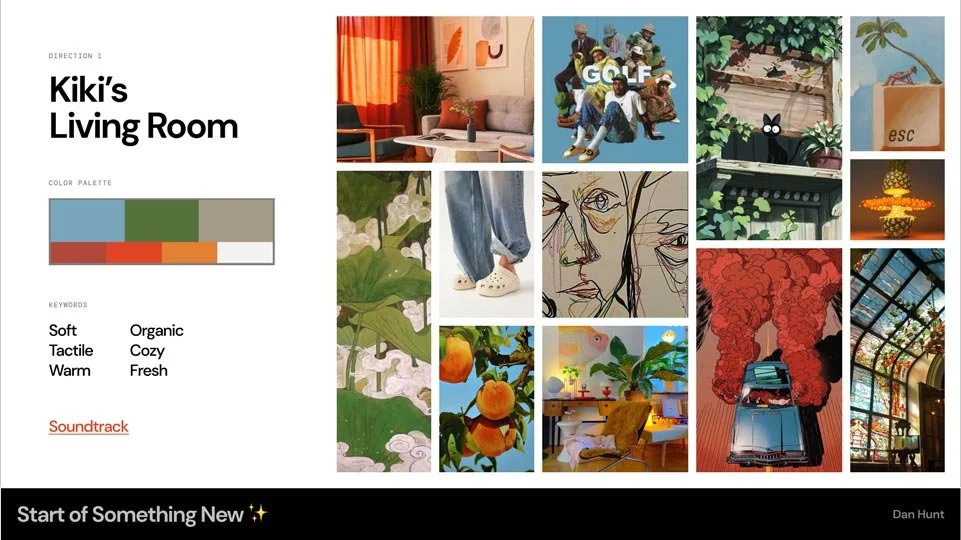
The first direction was my best attempt at distilling my personal vibe into a moodboard - White Crocs, muted colors, quirky illustrations, and cozy textures.
Check out the soundtrack here.
“Knucklehead”
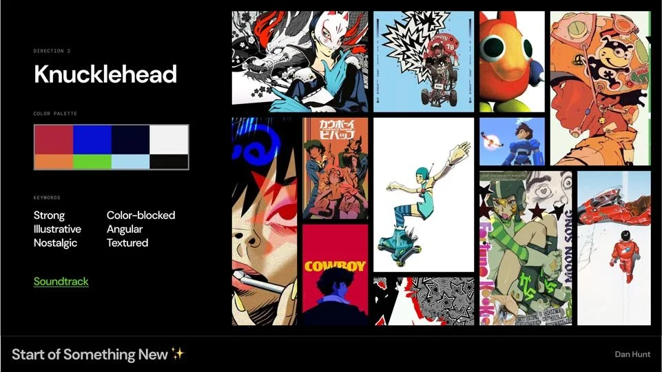
The second direction was an unexpected result from a wave of nostalgia I’d been experiencing at the time. Persona 5, Cowboy Bebop, and early 2000’s Drum & Bass video game music heavily inspired this grungier direction.
Check out the soundtrack here.
So… how did we end up here?
I wanted to do something more with the moodboards I made, and I knew that I needed to revamp my portfolio, so I took it as a challenge to tell a story with my portfolio’s design.
While I felt that the first direction might be more “true to me” and easier to implement on a portfolio site, I was feeling really drawn to the second direction. It had an exciting energy to it that I wanted to explore.
A common theme from my sources of inspiration for Knucklehead is sticking it to the man. Persona 5 and Jet Set Radio both feature a cast of kids who are on the run from the law, pursuing their own justice or living true to their beliefs despite what is socially acceptable.
Thinking on these topics made me ask the question,
“What does counterculture look like today?”

COUNTERCULTURE IN THE INTERNET AGE
My research started off looking into the counterculture movement of the 1960’s. To paint a very broad picture, the ethos of youth across the world was rejecting the norms of older generations in terms of politics, morality, art, and more. It was undoubtedly an iconic historical movement, but that ethos seemed kind of familiar to me even as a Zillenial in the age of social media activism.
I later found this fascinating article which provided a really key point of insight – social media is so engrained in the fabric of our society today that it’s difficult to participate in “countercultural” social movements (similar to that of the ‘60s) without playing by the rules of the cultural framework. True countercultural activity is about obfuscation – not contributing to echo chambers, not generating engagement for tech giants, and “going off the grid” in a way.
This was where I saw a parallel with my Knucklehead inspiration board. The Persona 5 crew hid their identities to carry out acts of vigilantism against public figures with dark secrets. In Jet Set Radio, the main gameplay is skating around & creating graffiti, an art form primarily performed by anonymous artists.
With this project, I decided to explore how to display my personal identity as a designer underneath a layer of anonymity.
WIREFRAMES
With my initial wireframes, I explored using angular, dynamic shapes and contrast to create sight lines and draw attention to certain elements on the screen that don’t quite follow standard UI patterns. I also played with layering elements on the screen to give a sense of dimension and allow the flexibility to hide and reveal certain aspects on the screen.

These patterns were meant to evoke a sense of “you’ll look where I guide you to look,” obscuring information and hiding what people want to see upfront a click or scroll away. This led me in the direction of making a large billboard the center point, updating the contents as users navigate through the page.


APPLYING VISUAL STYLE
Taking inspiration from Jet Set Radio, I wanted to evoke urban imagery like billboards, graffiti, and debilitated brick walls to create an underground & unfamiliar atmosphere. I imagined parallax effects of elements on screen enveloping my audience to make them feel like they’re a part of this environment.
SIMPLIFYING
My original plan was to create unique graphics & animations for the backdrop behind the billboard that updated with each hover state to really cement (pun intended) the street art aesthetic. However, due to limitations with my portfolio building site, I pared the idea down to just updating the color.
In hindsight, this compromise may have even worked out better, as I began running into issues at this point of the project with the strong contrast & visual elements taking attention away from the most important aspect of the site: the content. It’s one thing to progressively reveal information in an unusual order, but it’s another thing to drown it out with flashy visuals and interactions.
I also decided to drastically simplify the case study format for similar reasons:
The initial layout was failing to prioritize the content, and was generally very difficult to work with.
Conceptually, I thought it would be appropriate to be more upfront with details & identity at this stage of navigation through the site.
PLEASE NOTE
The background graphics in this GIF are not created by me. They are pulled from Persona 5 and this person on Reddit.

FINAL DELIVERABLE
Well… you’re looking at it.
LESSONS LEARNED
It was a fun experiment turning my idea into something real & interactive, but at the end of the day it’s still a portfolio website. The visual direction should serve the purpose of the product, not be an accessory to it.
As I continue to reflect on the design of this site, improve on it, and add more content, I aim to truly nail this approach in a way that communicates the concept, but does not detract from the experience of learning about me and my work. That is the priority, above just making something cool.